Overview:
Custom Views in Neostella provides a configurable framework for creating reusable layouts that define how information is presented within the platform.
Users can organize related data and components into centralized workspaces associated with a context. This ensures consistent information display.
Custom Views are configured based on a selected context among Global, Project, Person, Organization or Lead. The Global option allows users to display information from different entities.
Key Components:
Design tab:
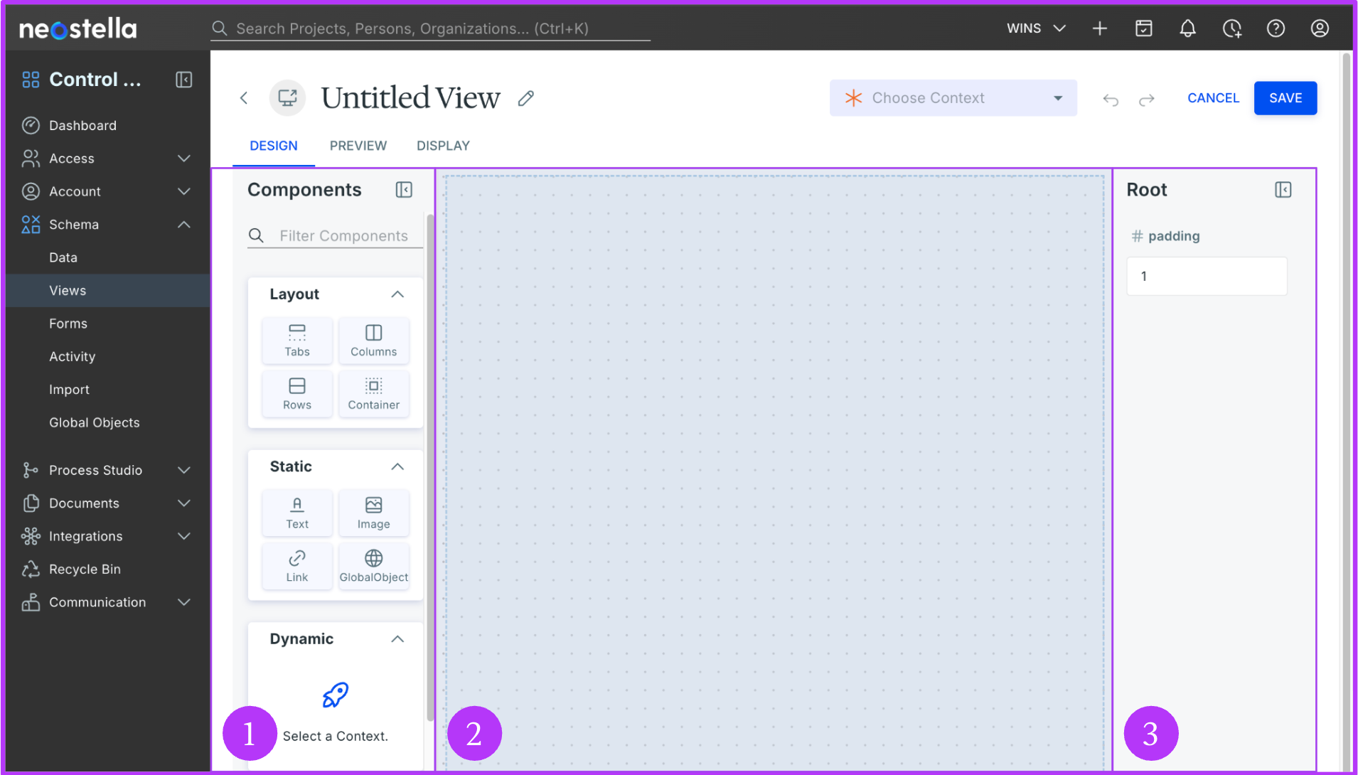
*Reference image of the Design Workspace.
Users can see a space with three main sections: Component panel, Canvas, and Configuration panel.
- Component panel: Allows users to select and drop components in the grid. There are three types:
-
Layout: Used for configuring the view structure.
(Tabs, Columns, Rows, and Containers) -
Static: Elements that remain visible in the view, regardless of the context.
(Text, Images, Link) -
Dynamic: Elements that change their content based on the selected context.
(Button, Form, Chart, Field, and Card)
-
Canvas: Gives users a space to drop and adjust components as well as configure the structure and contents of the view.
-
Configuration panel: Used for the configuration of the selected component.
Preview Tab:
This section allows users to see the customized view according to their permissions. In order to display the information, users must choose a record related to the selected context.
Display tab:
This section allows users to configure the General Display of the view, and choose the project Types, Roles, Permissions that will be displayed on their projects views.
There is an option to define the status of the view: Active, Inactive or Draft.
The Menu display icon, label and order can be configured in this section.
Technical Considerations:
Display: Custom Views are responsible only for layout composition; neither component behavior nor configuration.
Dynamic components:
These components are independent, declarative, and reusable. Each one of them is linked with a specific object which supports multiple records within the same context This dynamic component automatically determines the record to use based on the selected context.
Component characteristics:
- Self-contained
- Context-aware
- Reusable across multiple views
Requirements:
| Element | Description | Type |
| Name | Identifies the Custom View. | Required |
| Menu Selector | Defines where the Custom View appears in the platform menu. | Required |
| Context | Specifies the object or record type associated with the Custom View. | Required |
| Status | Defines whether the Custom View is Draft, Active, or Inactive. | Required |
| Label | Defines the name displayed to users. | Required |
| Order | Determines the position of the Custom View within the interface. | Required |
| Icon | Defines the icon displayed for the Custom View. | Required |
| Context Type | Narrows the Custom View to a specific context type when needed. | Optional |
| Roles and Permissions | Determines which users can access or manage the Custom View. | Optional |
How to use:
Here's an interactive tutorial